Case Study: SLO Tool
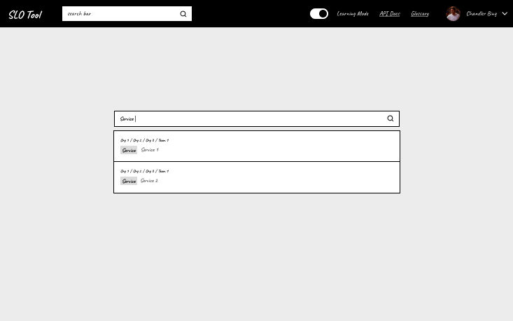
Table of Contents
- Preface
- What is the project
- About my work
- Before and After
- My Design Strategy
- Tools for Phase 2
- My Design and Design Delight
- Final Result
Preface
This case study has been recreated to strip all NDA and sensitive material pertaining to my old company and showcases my design thoughts and strategy.
- Mockups were recreated.
- Diagrams were abstracted and the details were removed.
- All visual design details have been removed.
- Company name and project name has been removed.
- No data or metrics have been exposed.
What is the project
SLO Tool is an internal tool I worked on at a previous company I worked for. It's an app that manages each team's SLOs or Service Level Objectives. SLOs are industry standard practice for server app failures, downtime, and latencies. They are definitions for how business teams should respond when a failure happens or when the network performance is slow.
About my work
For this project, I was the lone designer for an engineering team and produced a design wireframe. I was responsible for defining the project direction through my design methods and quickly understood the underlying requirements and the domain knowledge. I also highlight some major design decisions throughout this post.
Before and After
Before
- The old app was built by engineers was difficult to use by everyone.
- There were multiple other tools with overlapping functionality (multiple sources of truths).
- The site reliability team is the bottleneck that manually engages with other teams.
- The end users are not subject matter experts and look to the site reliability team for help.
After
Defining the Project Direction from the Design Perspective
I was initially assigned to this project because the team wanted to improve the user experience of SLO's. They were a newly scaled team of 6 engineers without design expertise. As a high-performing team that was eager to move quickly and see results, I had to adapt to their style and needs to gain trust and influence as a designer. For instance, I figured out that the team wouldn't trust me if they waited several months for a design, so I adapted to a weekly iterative approach.
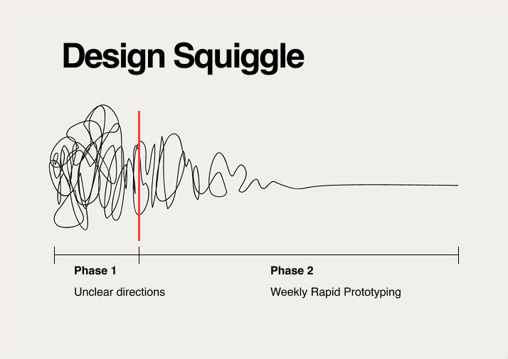
Early on, the project lacked a clear direction. The hardest part of this project was the early stage where we circled a lot on the same concerns and complex decisions.
I found that committing to any direction was expensive, which worked against the team that has a fast-paced style and wants quick results. For instance, one direction for a week was to improve one feature in the existing tool. It was an expensive use of human resources and didn't help the overall problem.
Other directions we circled on were:
- Should this project even exist?
- Should we rely on the industry standard tool, Grafana?
- Should we invest in a whole long term project for a totally new revamp tool?
- How many engineers or design resources should we commit?
After critically thinking, I proposed that we do a weekly iterative rapid prototype of a new user experience revamp. Why I think this is good:
- A weekly rapid prototype eliminates the risk of over-committing to wrong directions or wrong projects. The only resource for a rapid prototype is design, not fully-fledged teams.
- The original purpose of improving the overall user experience is maintained, which they were afraid to commit to due to uncertainties.
- The rapid prototype provides weekly validation for the customer team which they can pull plug at any time.
- If the direction is valid each time, the rapid prototype would transition into a tangible deliverable.
- To ensure that it is valid every week, the prototype would gather perspectives of all stakeholders.
This was the first major decision of this project. With this solution, all the concerns and complex decisions were squashed. Through this design strategy, a clear, low-risk direction is established.
After getting approval from the customer, during the next phase, I would talk to several stakeholders and subject matter experts in a one on one, update one of my project artifacts, and share the artifacts with channel of every stakeholder at the end of each week. Trust is built through transparency, confidence is built in the project direction, and feedback and opinions of stakeholders all made it into the prototype.
Project Artifacts, Methods, and Tools
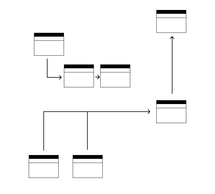
- Domain Model Diagram - This diagram serves multiple purposes. It's a diagram to help me understand SLOs in software terms, which helped me define the information architecture on the design side (e.g. what information is owned on what org level). It's also a diagram to plan both the backend and frontend code after the design phase.
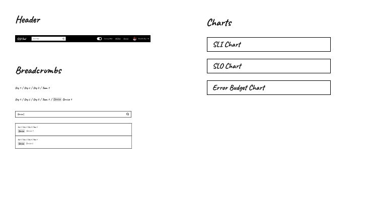
- Components - Coming from an experienced frontend background, I considered every component's frontend specs for the implementation phase.
- Clickable Wireframe - The final deliverable and facilitation tool with consideration of user interactions
- Slack - A channel to get all stakeholders, subject matter experts, and leadership in one "room" for weekly updates, questions, and conversations.
All artifacts were done in Figma.
My Design
My other two major decisions in the project were:
- Support non-technical users as the customer originally requested.
- Teach the domain knowledge to the end user but not lower the quality of the domain knowledge.
Here are my designs that reflect those decisions:
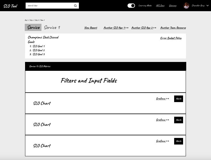
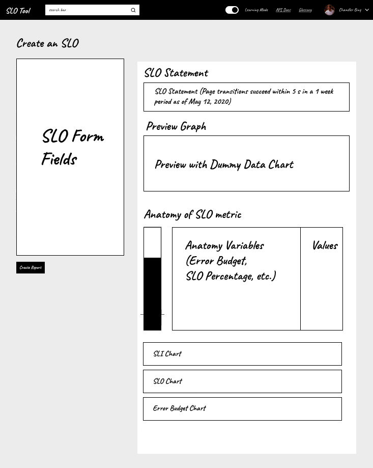
- Elements of learning - I tried to teach the non-technical user the domain knowledge at every opportunity. I threw in a learning mode that would turn on math calculations and definitions throughout all pages. I added a glossary page for all the domain terminologies, and an interactive playground to develop 1:1 understanding.
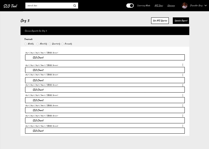
- Elements of single source of truth - The tool will consolidate links of all other overlapping tools to create an inclusive experience. Everything you need to know about SLO's in the company is found on this one app. The tool allows flexibility to use other tools for edge cases, and is also a safe way to gradually replace the old tool in case the new tool is has flaws.
- Incorporating the domain - Unlike the industry standard tool, Grafana, my design was not just a metrics dashboard, but a true SLO tool that directly integrates domain practices like error budget policies and social contracts into the user experience. Through the user experience alone, the user is guided like training wheels to do things the "right" way.
Final Result
- I was able to create a product that is inclusive to non-technical users, and expand the userbase to top executives.
- I was able to drive a project direction and lead the team through my experience and understanding of design.
- I was able to create a high-fidelity prototype that incorporates all stakeholders' feedback, opinions, and requirements.
- I was praised by the engineering lead project owner and his leadership for good work.
Major Project Decisions:
- Persuade the project owner on rapid prototyping instead of killing the effort before trying.
- Support non-technical users as the customer originally requested.
- Teach the domain knowledge not lower the quality of the domain knowledge.